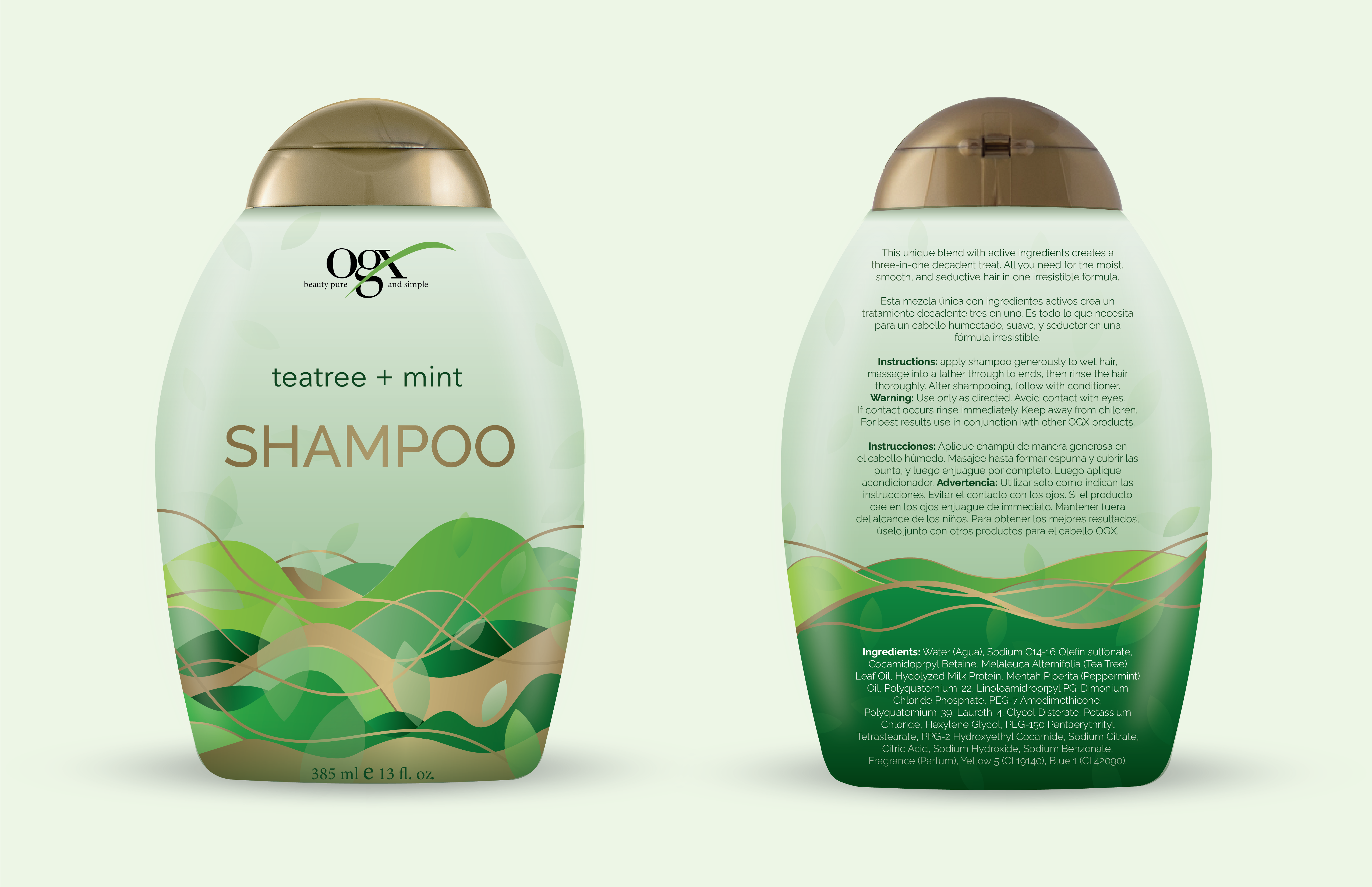
For this project, we took a product and changed its packaging design while staying within its overall brand guides. I chose OGX shampoo because I felt the original design made it hard to see the logo. We also researched competitors, so within the shampoo brands, I noticed others had logos much larger than OGX.
After researching, I was inspired by how their brand wants to promote organic and natural ingredients. I used organic lines with their brand colors to create a new design. I chose this fluid pattern to represent a combination of nature and hair.
FINAL


