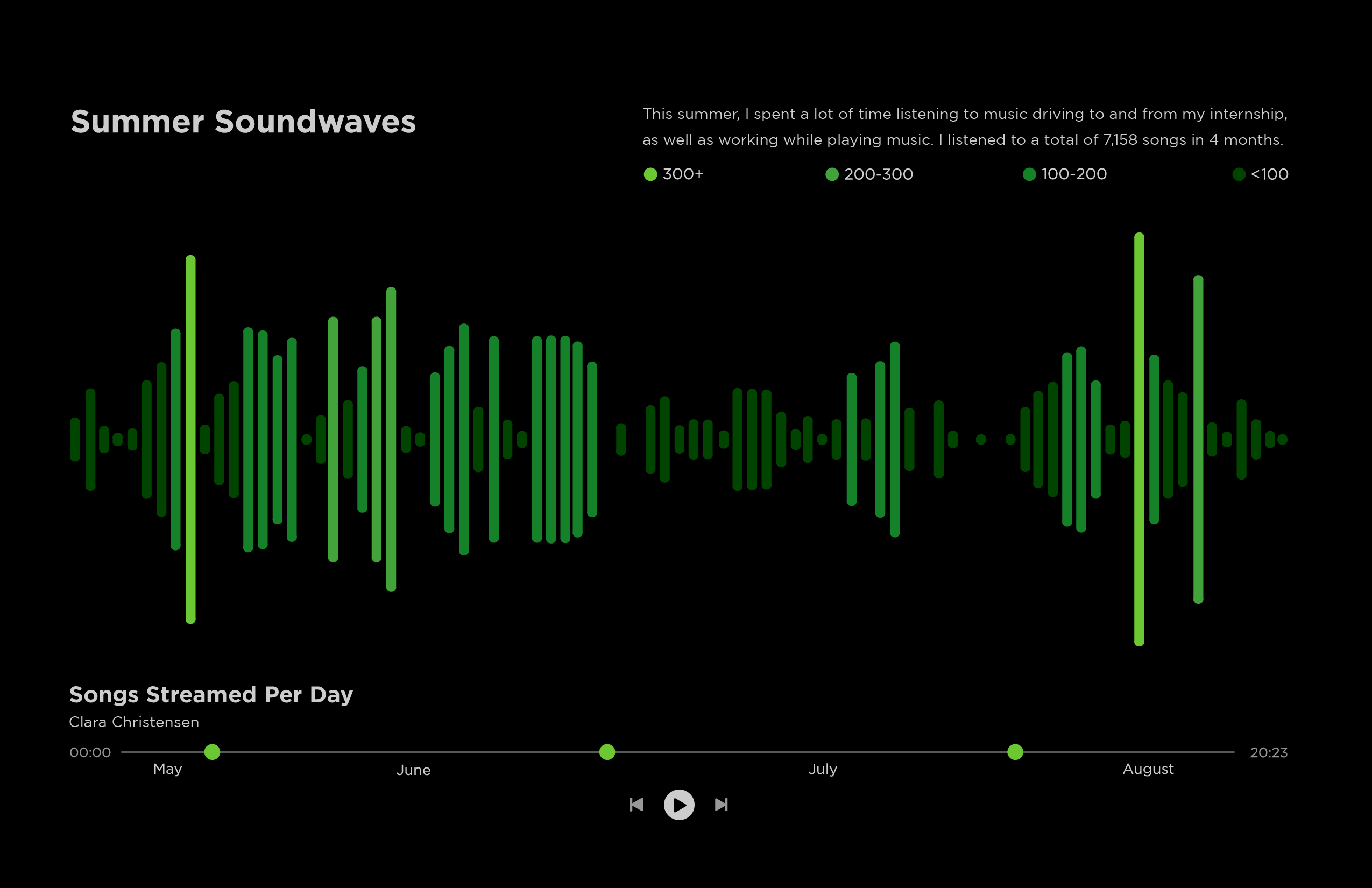
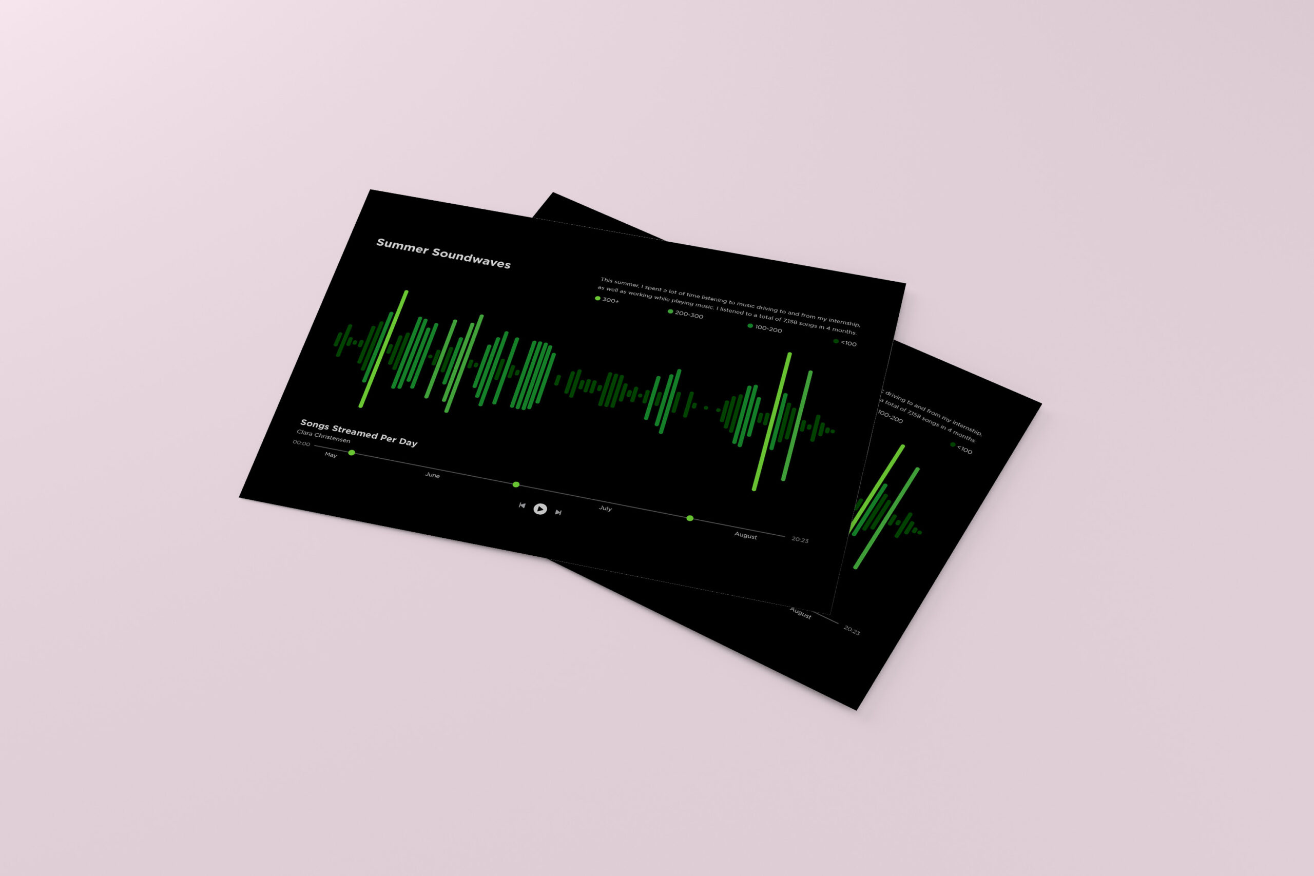
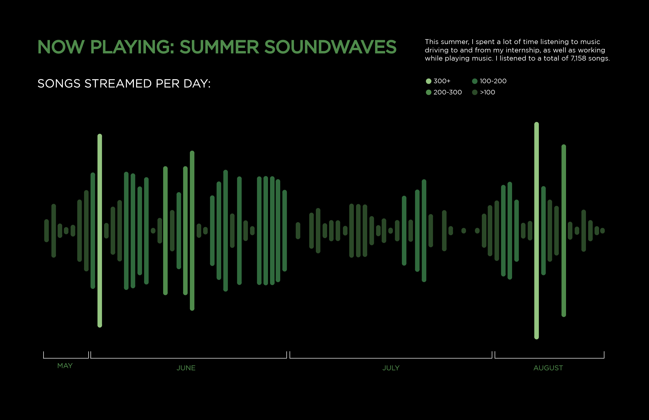
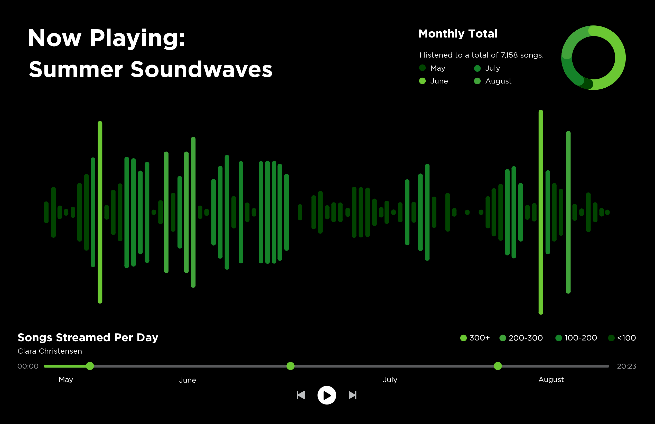
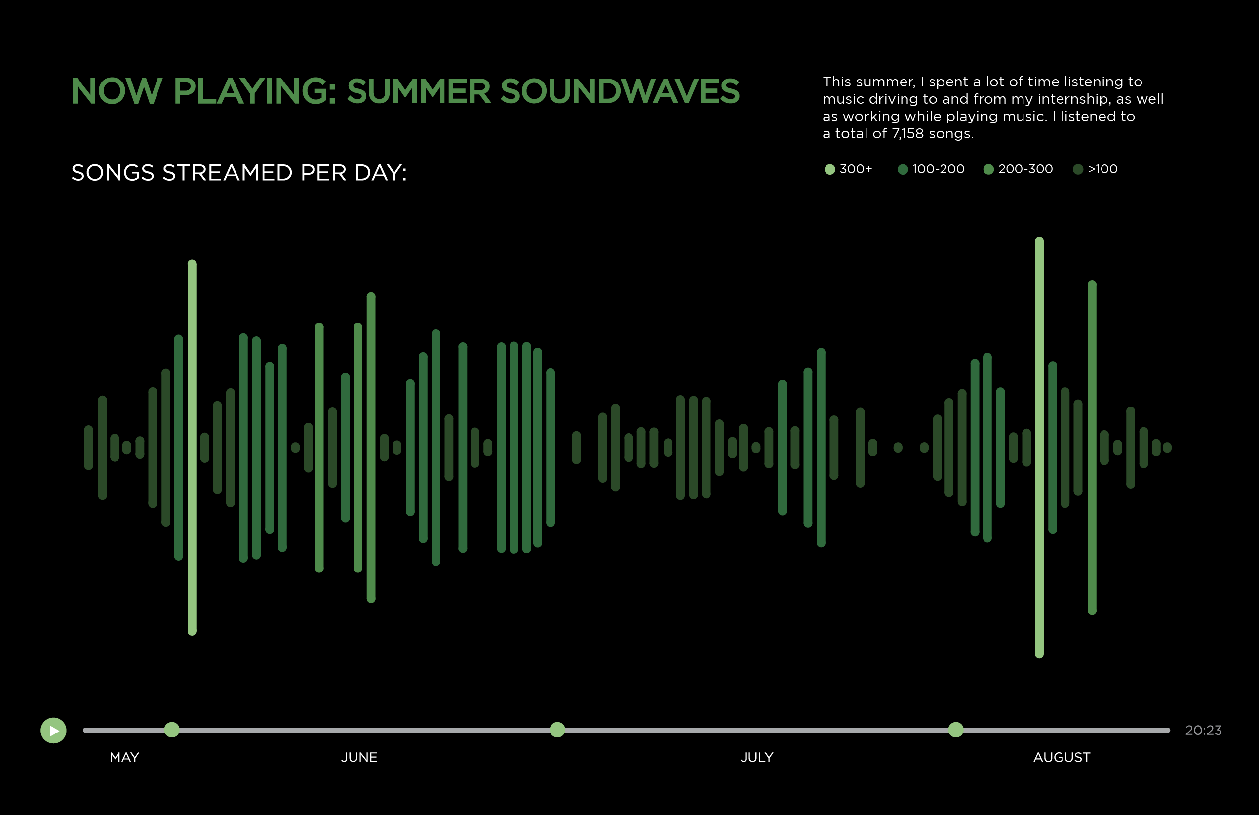
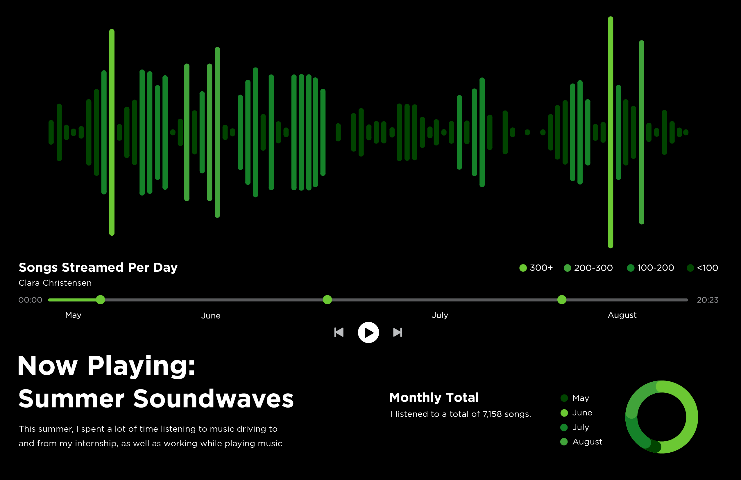
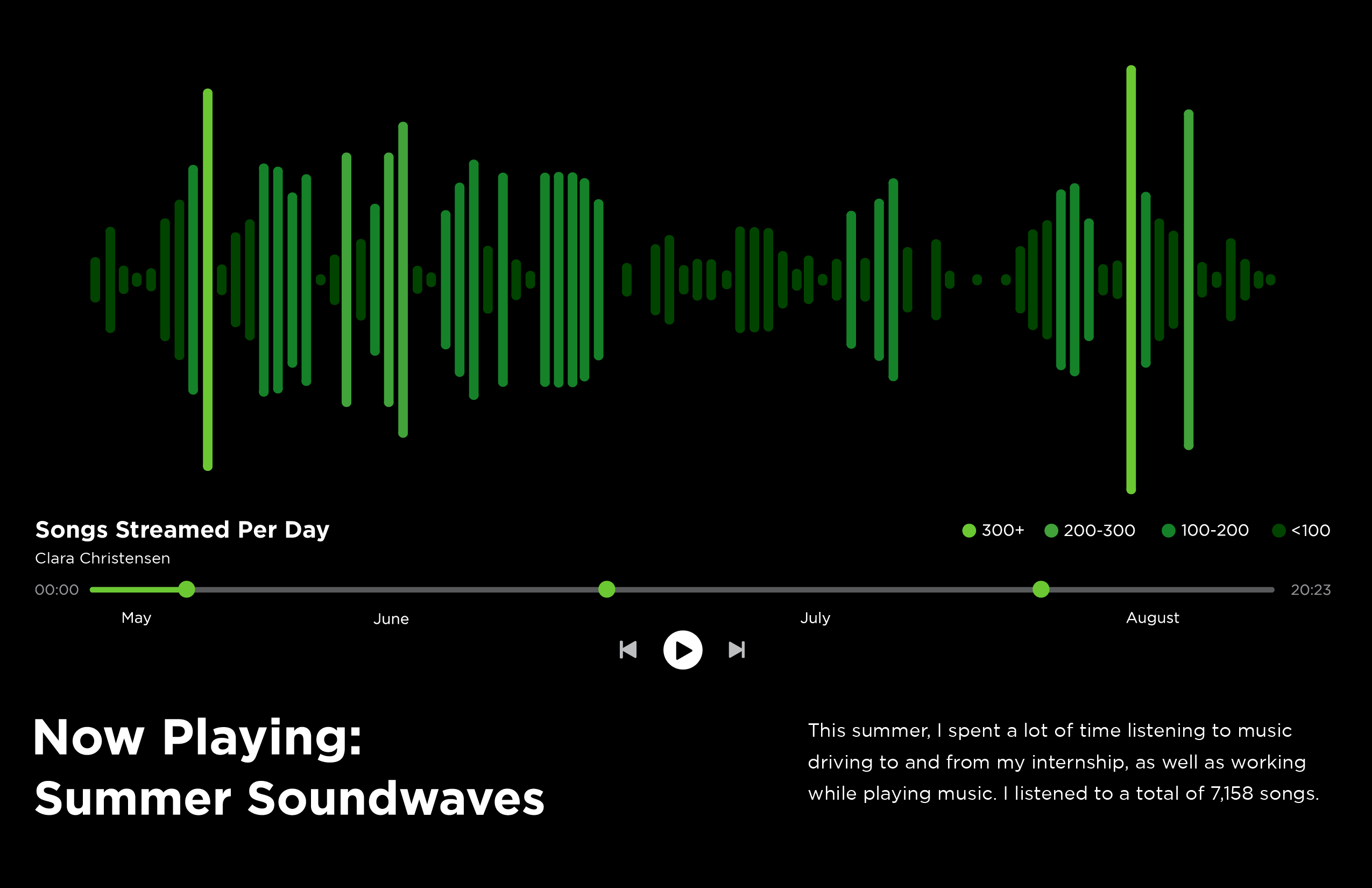
During our senior year, we were assigned an infographic project that represents a system of information collected over summer break. Between driving to work and purely just enjoying music, I chose how many songs I listened to on Spotify each day.
My design was inspired by Spotify, imitating what you see when you play a song. I created my graphic to look like a soundwave, with the days I listened to more songs appearing "louder". Here's my process of displaying this information:
PROCESS

FINAL
